Building My Personal Portfolio: A Journey into React, Three.js, and More


Introducing my personal portfolio project
I'm excited to share my latest blog post, where I'll walk you through the journey of building my personal portfolio project. Inspired by JavaScript Mastery's YouTube channel, I used React Vite for efficient development and Tailwind CSS for seamless styling.
The project's highlights include captivating 3D models of a computer and Earth, created with Three.js and Three Fiber. These models are animated using Framer Motion, which creates engaging and interactive experiences. I also learned and implemented High Order Components (HOCs), which allowed me to reuse code and DRY up my code base. Additionally, I integrated EmailJS to make it easy for visitors to contact me.
The result is a visually appealing, responsive, and functional website that showcases my skills and passion for web development.
To follow along with the code you can refer to my GitHub repo:
Niranjangkr/3D_Personal_Portfolio_site (github.com)
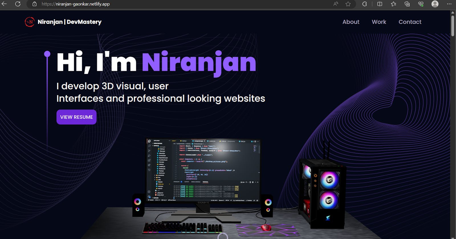
Click the link to view my site: niranjan-gaonkar.netlify.app
The structure of my App.jsx
import React, { Suspense } from "react";
import { BrowserRouter } from "react-router-dom";
import {About, Contact, Experience, Feedbacks, Hero, Navbar, Tech, StarsCanvas, Blog, Works } from "./components";
import { ErrorBoundary } from "react-error-boundary";
import fallbackRender from "./components/ErrorBoundary";

const Connect = React.lazy(() => import("./components/Connect")); //lazy loading to improve performace of the site

const App = () => {
  return (
  <BrowserRouter>
   <div className="relative z-0 bg-primary">
    <div className="bg-hero-pattern bg-cover bg-no-repeat bg-center">
      <Navbar />
      <Hero />
    </div>
    <About />
    <Experience />
    <Tech />
    <Works />
    <Blog/>
    <ErrorBoundary FallbackComponent={fallbackRender} onReset={()=> {}}>
    <Suspense fallback={<div>Loading...</div>}>
      <Connect />
    </Suspense>
    </ErrorBoundary>
    {/* <Feedbacks />  */} {/*createed but not used need some changes */}
    <div className="relative z-0">
      <Contact />
      <StarsCanvas/>
    </div>
   </div>
  </BrowserRouter>
  )
}

export default App
The structure of my App.jsx file shows all the components I used for different sections of my website.
Each Section Explained:
1) Navbar and Hero:
Navbar
So, on the top, I created a simple navigation bar using React. The
Navbarcomponent consists of a logo, a menu, and navigation links to different sections of the portfolio. Below is an explanation of it:State Management: The component utilizes React's
useStatehook to manage two states -activeandtoggle. Theactivestate keeps track of the currently active navigation link, whiletogglecontrols the display of the mobile menu.React Router: The
Linkcomponent from React Router is used to enable smooth navigation between different sections of the portfolio.Styling: The navigation bar's appearance is styled using Tailwind CSS classes, making it responsive across various screen sizes. The
stylesandconstantsmodules hold CSS styles and navigation link data, respectively.Logo and Icons: The
logoN,menu, andcloseimages are used as icons for the logo, menu, and close button, respectively.Dynamic Navigation Links: The component dynamically generates navigation links based on the
navLinksarray. Each link corresponds to a specific section of the portfolio and highlights the currently active section.Mobile Responsiveness: The navigation bar adapts to mobile devices using the
hiddenandflexclasses to toggle the mobile menu on and off when the user clicks the menu icon.
Hero
The Hero section is one of the most captivating parts of the portfolio, where the user is introduced to the essence of the website. It has an 3D computer model, which is rendered using the separate
ComputersCanvascomponent.Structure:
The Hero section consists of multiple elements, such as the heading, subtext, and a call-to-action button (VIEW RESUME).
A 3D computer model is placed on the left side of the section, while the introduction text is positioned on the right side.
Styling:
Tailwind CSS classes are used for responsive styling and layout control.
The Hero section spans the entire screen height (
h-screen) and adjusts its width based on the screen size (w-full).Various CSS classes control the text color, font size, padding, and background colors, providing an aesthetically pleasing and visually appealing design.
Animation:
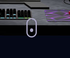
The animation of the Hero section which is the small cursor-like part was made using
framer-motion.A small animation, represented by a bouncing dot, is placed at the bottom of the section, guiding users to scroll down and explore further sections of the portfolio.
3D Model Integration:
- The
ComputersCanvascomponent is imported and rendered within the Hero section, displaying the 3D computer model.
- The
Computer Canvas
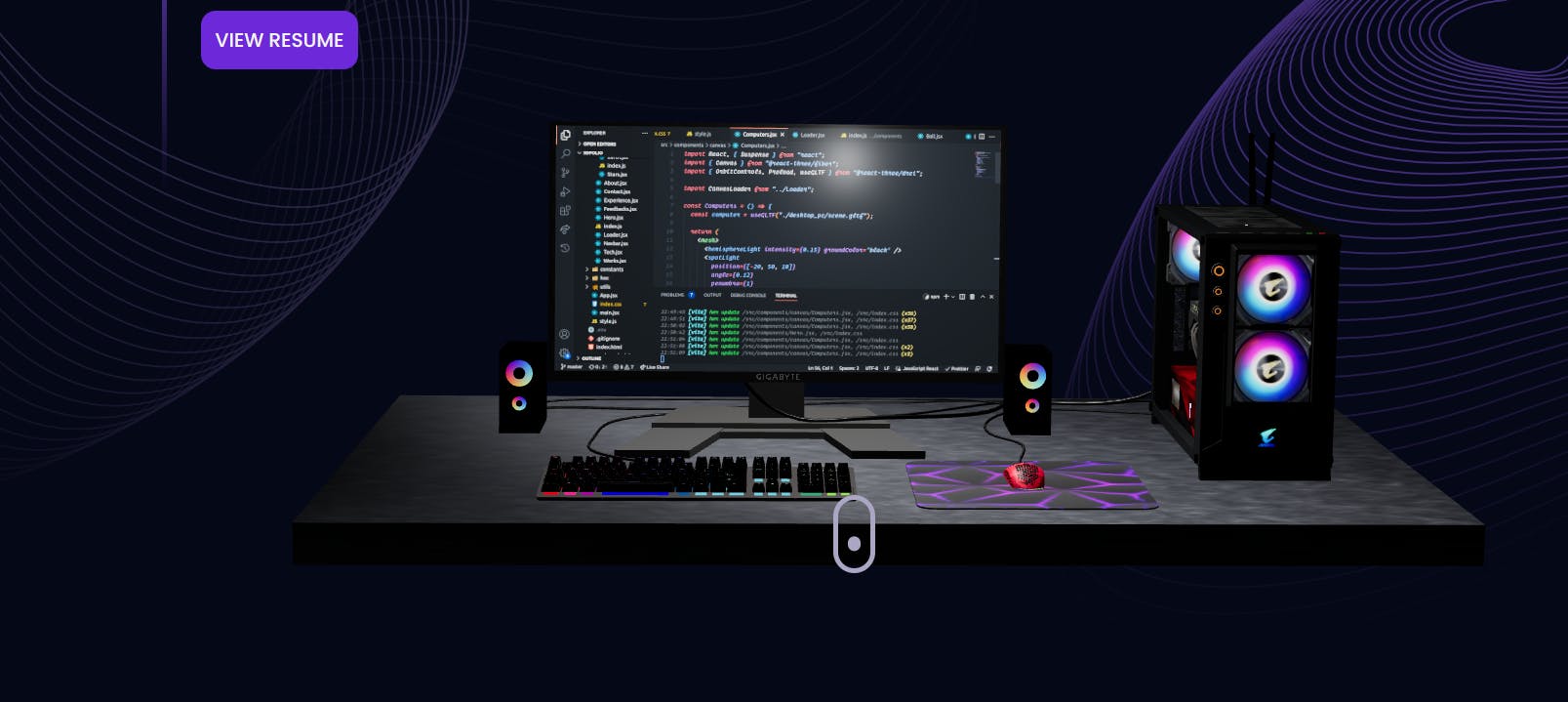
The ComputersCanvas component is a captivating addition to the portfolio, providing an immersive display of a 3D computer model on the website. while building this component many different concepts were introduced which I learnt while building like cameras, gltf, lights, canvas, suspense and code splitting etc.
The ComputersCanvas component imports and renders the 3D computer model using the useGLTF helper from @react-three/drei, enabling the website to showcase a visually appealing 3D representation. The component also sets up lighting with hemisphereLight, spotLight, and pointLight for enhanced visual effects. The 3D model's scale, position, and rotation are adjusted based on whether the user is on a mobile device or not, ensuring optimal visual presentation on all screens.
Responsive Design: To ensure a seamless experience on various devices, the component detects if the user is on a mobile device using the window.matchMedia API. The model's size and position are then adjusted accordingly using the isMobile state variable.
Interactive Features: The OrbitControls component from Three.js allows users to interact with the 3D scene, enabling orbiting, panning, and zooming around the computer model. With these interactive features, visitors can explore the model from different angles, enhancing the overall user experience.
Asynchronous Rendering Handling: To handle asynchronous rendering and code splitting, the Suspense component is used to define a fallback UI (CanvasLoader) that is displayed while the 3D model is loading. This provides a smooth and seamless loading experience for users.
The ComputersCanvas component truly elevates the visual appeal of the portfolio, giving visitors an engaging and interactive experience with the stunning 3D computer model. you can search online to find some amazing 3d models for your websites
CanvasLoader
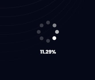
The CanvasLoader is a stylish and dynamic addition to the portfolio, ensuring a seamless and engaging user experience during the loading of 3D assets. With its simple yet effective design, the loader keeps visitors captivated and informed about the loading progress.
Key Features: The CanvasLoader utilizes the useProgress hook from @react-three/drei to track the loading progress of 3D assets. With a sleek Html container, the loader displays an animated spinner represented by the canvas-loader class, while the loading progress is shown as a percentage. The design maintains a consistent flow with the overall artistic appeal of the portfolio.
Interactive Loading: By elegantly combining loading functionality and visual aesthetics, the CanvasLoader ensures visitors are engaged and aware of the loading process. The percentage progress display provides a real-time update, keeping users informed and connected during the loading phase.
Seamless Experience: The CanvasLoader plays a crucial role in enhancing the overall user experience, demonstrating a commitment to seamless navigation and exceptional design throughout the portfolio.
2 ) About Section
The About component beautifully presents an overview of my skills and expertise. It utilizes the motion module from Framer Motion to create smooth and captivating animations throughout the section.
Text Animation: The content in the About section is gracefully animated using the fadeIn function from the motion module. This function introduces delightful motion effects to the introductory text and service cards, engaging visitors and adding an artistic touch to the presentation.
Service Cards Animation: The component showcases a grid of Service Cards, each representing a specific skillset. These cards are elegantly animated into view using the motion module. React Tilt is utilized to add a subtle tilt effect, enhancing the visual appeal and interactive feel of the cards.
Interactive Skill Display: Each Service Card contains an icon and a title that dynamically emerge on the screen using motion animations. This interactive approach allows visitors to explore my diverse skillset with an engaging and user-friendly experience.
Seamless User Experience: The blend of smooth animations, concise content, and visually appealing design results in a seamless and captivating user experience. The About component successfully captivates visitors, presenting a comprehensive overview of my skills and expertise in an artistic and interactive manner.
3 ) Experience section
The Experience section showcases my journey with a dynamic and engaging presentation. Using the VerticalTimeline component, the section elegantly displays my work experiences in chronological order.
Key Features:
Animated Introduction: The Experience section begins with an animated introduction, using the
motionmodule from Framer Motion. The headings and content smoothly fade into view, creating an immersive reading experience.Chronological Timeline: The section employs the
VerticalTimelinecomponent, providing a visually appealing timeline layout for my work experiences. Each experience is represented as a separate card on the timeline, enhancing readability and navigation.Interactive Experience Cards: Experience cards are designed using
VerticalTimelineElement. They include essential information, such as the title, type, date, and logo. The cards are interactive, allowing visitors to click on URLs associated with the experiences for further exploration.Customized Styling: The component's styling is thoughtfully crafted, with a dark background and contrasting text color to maintain a consistent artistic appeal with the rest of the portfolio.
4 ) Tech Section
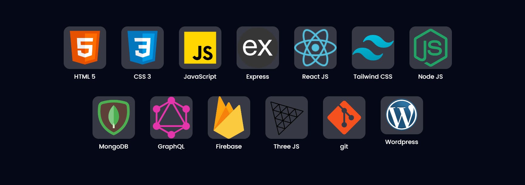
The Tech component was created to showcase my proficient technology stack in an engaging and visually appealing manner. The logic behind rendering the cards involved mapping through the technologies array, which contains the data for each technology, including its name and corresponding icon. For each technology, a separate card was generated, displaying the icon and name within a fixed-size container.
The backdrop-blur effect added to the cards enhanced their visibility. The backdrop-blur-sm class, coupled with bg-white/20, applied a light blur to the background of the technology icon, allowing it to stand out from the surrounding content. This effect contributed to the overall visual appeal of the Tech section.
By employing a straightforward layout and leveraging interactive animations, the Tech component effortlessly showcases my diverse technology stack. The user-friendly design encourages exploration, offering visitors a glimpse into the range of skills that empower my development journey.
Works Section
The Works component presents a selection of my notable projects in a visually appealing manner. Leveraging the ProjectCard function, I dynamically render individual cards for each project, featuring its name, description, associated tags, and project image. These cards are then smoothly animated into view using the motion.div component from Framer Motion, creating an engaging and seamless user experience.
Key Features:
Interactive Project Cards: Each project is encapsulated within a
ProjectCardthat provides interactivity and visual appeal through animations and hover effects. Themotion.divcomponent manages the entry and exit animations of these cards, ensuring smooth transitions when displaying projects.Tagged Categorization: The projects are categorized and tagged based on their technologies, allowing visitors to quickly identify projects relevant to their interests. The tags are elegantly displayed below each project description, providing an organized overview of the project's technologies.
Flexible View Options: The component allows visitors to view a curated selection of projects initially, with only three cards displayed at the start. By clicking the "Show All" button, users can reveal all projects for a comprehensive overview. The toggle logic is achieved using the
useStatehook and theslicemethod to control the number of displayed cards.
The Works component utilizes Tailwind CSS for responsive and customizable styling. With Tailwind classes, I created a visually appealing and consistent layout that adapts well to various screen sizes. Furthermore, Framer Motion's animation capabilities brought life to the project cards, enhancing the overall user experience.
Blog Section
The Blog section on my portfolio is powered by the Hashnode API, providing a seamless way to fetch and display my blogs directly from my Hashnode account. To achieve this, I utilized GraphQL to define the query for fetching user-specific articles, which included information like title, brief, slug, date, cover image, and the content in Markdown format.

I have explained in detail how I built this Blog Section using Hashnode API in my previous blog do check that out: Hashnode API to integrate your blogs to your website.
Connect section
The Connect section on my portfolio invites visitors to engage with me across various social platforms, promoting open communication and collaboration. The section features an array of social media icons, each uniquely designed using a custom SphereCanvas component.
Social Media Icons: The SphereCanvas component was designed to represent social media icons with an interactive 3D sphere effect. Using Framer Motion, I animated each icon, providing an eye-catching visual representation for a seamless user experience.
Engaging with Multiple Social Platforms: I integrated the SphereCanvas component with the socials array, which contains information about various social media platforms that is Twitter, LinkedIn and GitHub . Each icon was linked to the respective social media account, allowing visitors to connect with me on their preferred platform.
Key Features:
Custom SphereCanvas Component: The
SphereCanvascomponent was crafted to add a unique and visually captivating 3D sphere effect to each social media icon. The Framer Motion library was utilized for smooth and dynamic animations.Extensive Social Media Engagement: The Connect section provides easy access to multiple social media platforms, enabling visitors to interact with me and stay updated on my latest projects, blogs, and professional achievements.
Contact Section
The Contact section on my portfolio enables visitors to easily get in touch with me, and feedback. This section combines a captivating EarthCanvas component and a user-friendly contact form, making it convenient for users to send messages directly to my email.
Interactive EarthCanvas Component: The Contact section features the EarthCanvas component, which adds an interactive and visually appealing 3D Earth globe. The EarthCanvas is designed to engage visitors and create an immersive experience.
User-Friendly Contact Form: The contact form is thoughtfully designed to gather essential information from visitors who wish to connect with me. It includes fields for the user's name, email, and message, enabling them to convey their thoughts or inquiries with ease.
Submitting Messages with EmailJS: Upon submitting the contact form, the information provided by the user is sent using the EmailJS API. EmailJS efficiently handles the email delivery process, ensuring reliable and timely delivery of messages to my designated email address.
Form Submission Handling: The form submission is accompanied by a user-friendly loading state, indicated by the "sending..." message on the submit button. After successful submission, users receive an alert confirming their message was received and will be addressed shortly.
Key Features:
EarthCanvas Component: The EarthCanvas component enriches the user experience by displaying an interactive 3D Earth globe, creating a visually captivating effect for visitors.
EmailJS Integration: The integration of the EmailJS API streamlines the email delivery process, ensuring that messages from visitors are delivered efficiently and reliably.
EarthCanvas Component
The EarthCanvas component creates a 3D canvas that displays an Earth model with some interactive features. It uses the Three.js library along with the @react-three/fiber and @react-three/drei packages to set up the 3D environment.
The EarthCanvas component renders a 3D canvas with a 3D model of the Earth, providing interactive controls like auto-rotation and orbiting. The Earth model is loaded using the GLTF file format, and the OrbitControls allow users to rotate around the Earth. The component is visually engaging and enhances the user experience with a 3D representation of the Earth.
Star Canvas
The StarsCanvas is a component that creates a starry sky background using the Three.js library. It adds a visually appealing animated starry effect to a website or application.
Here's an explanation of the code:
Importing Dependencies: The component imports the necessary dependencies, including
React,useState,useRef,Canvas,useFrame,Points,PointMaterial,Preload, andSuspense. It also imports themaath/randomlibrary for generating random star positions.Generating Star Positions: The
Starscomponent uses theuseFramehook to animate the stars by rotating them slightly on the x and y axes. It uses therandom.inSpherefunction from themaath/randomlibrary to generate an array of random 3D positions (x, y, z) within a sphere of radius 1.2. These positions will be used as the star coordinates.Creating the Stars Group: The
Starscomponent returns a group containing the stars. It uses thePointscomponent from@react-three/dreito render the stars with the positions generated earlier. ThePointMaterialsets the appearance of the stars, including their color, size, and depth properties. Thetransparentproperty is set to true to enable transparency, allowing the stars to blend with the background.Animating the Stars: The
useFramehook updates the rotation of the stars' group on each frame. This provides a smooth and subtle animation to the starry background.Creating the StarsCanvas Component: The
StarsCanvascomponent wraps the starry background within aCanvascomponent from@react-three/fiber. TheCanvascomponent sets up the Three.js scene and camera. It uses aSuspensecomponent to handle any loading process if required (though currently set tonullsince there's no loading requirement in this case).Rendering the StarsCanvas: The
StarsCanvascomponent returns adivelement with the starry background canvas. It positions the canvas absolutely and sets the z-index to -1 to place it behind other content. The starry sky will cover the entire available viewport.
Overall, the StarsCanvas component creates an animated starry background using Three.js, providing a visually appealing and dynamic effect to the webpage.
Conclusion
In conclusion, my personal portfolio project is a culmination of my passion for web development, showcasing various modern technologies and creative concepts. From captivating 3D models to smooth animations and user-friendly interactions. Through this project, I've honed my skills in React, Three.js, and Tailwind CSS, while also exploring GraphQL and EmailJS for seamless data integration. Overall, this portfolio represents my journey as a web developer and serves as a dynamic showcase of my work and expertise in the field.